


Reading small gray text on a bright screen can quickly cause eye fatigue, particularly under strong outdoor sunlight or for individuals with changing eyesight. Android includes a dedicated accessibility feature called High Contrast Text that sharpens letterforms by converting text into solid black or white with crisp contrasting borders. In this step-by-step guide, I will show you how to enable this setting in seconds.

Understanding High Contrast Mode on Android
Many modern app interfaces use subtle pastel shades, gray fonts, or semi-transparent backgrounds for aesthetic reasons. While modern-looking, this low contrast makes words harder to discern. Enabling High Contrast Text overrides delicate styling and forces text into high-visibility black or white, creating a distinct visual separation between text and background.
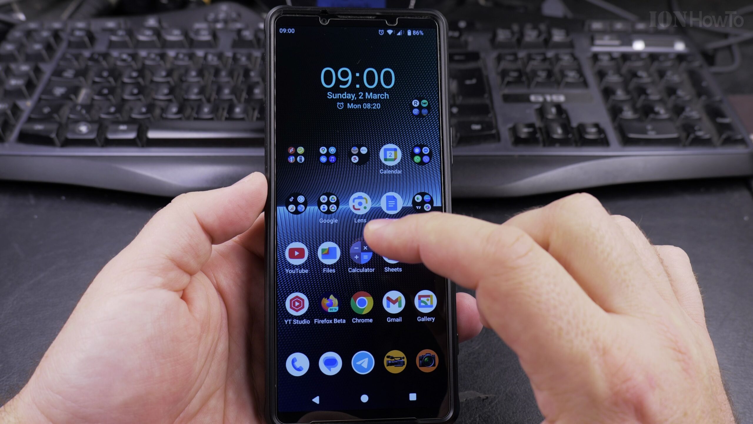
Step 1: Open Settings and Select Display
Unlock your Android device and open the Settings application by tapping the gear icon on your home screen or inside the app drawer. From the main settings list, scroll down and tap on Display (or Accessibility on select Android models).
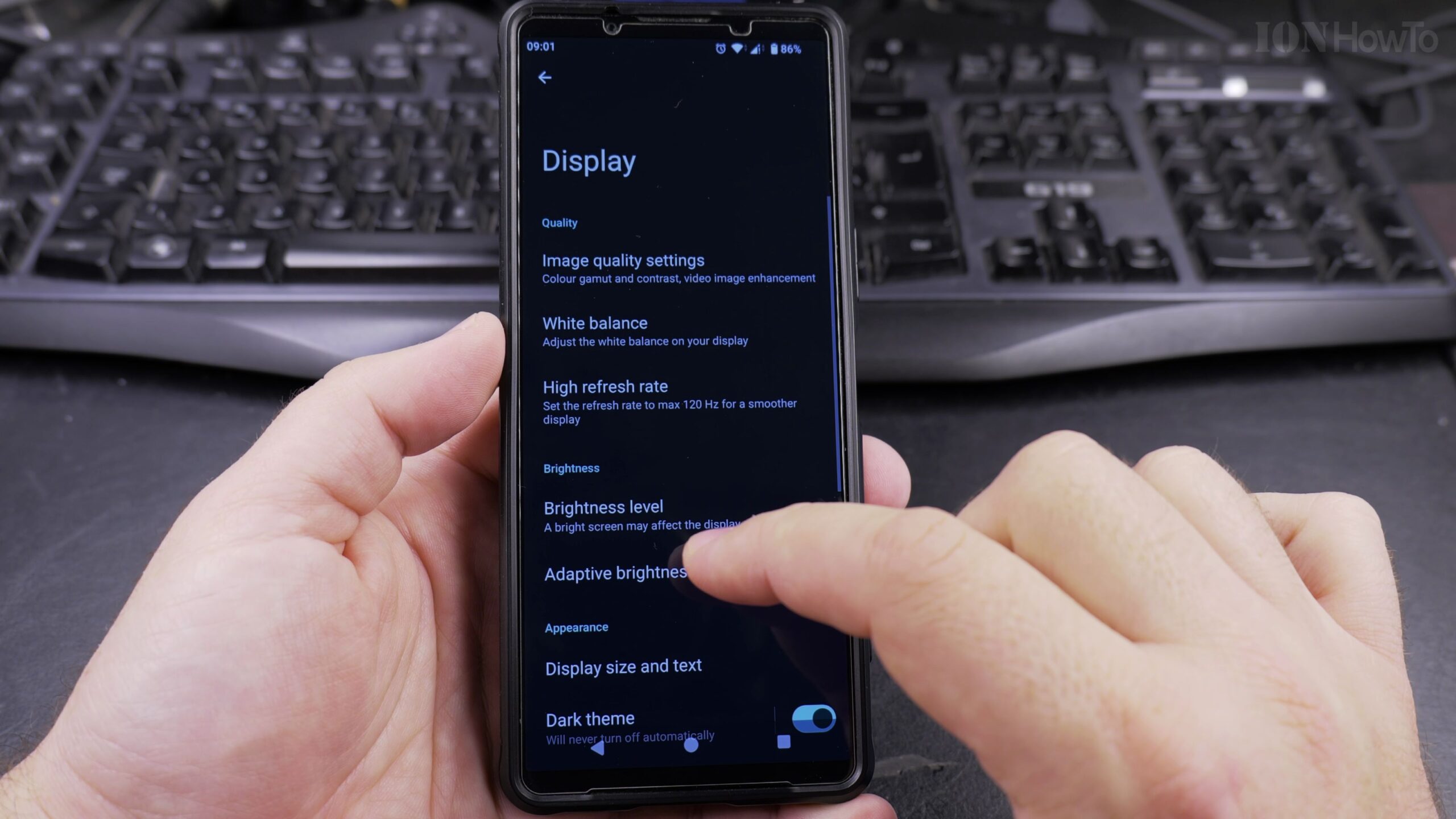
Step 2: Navigate to Display Size and Text
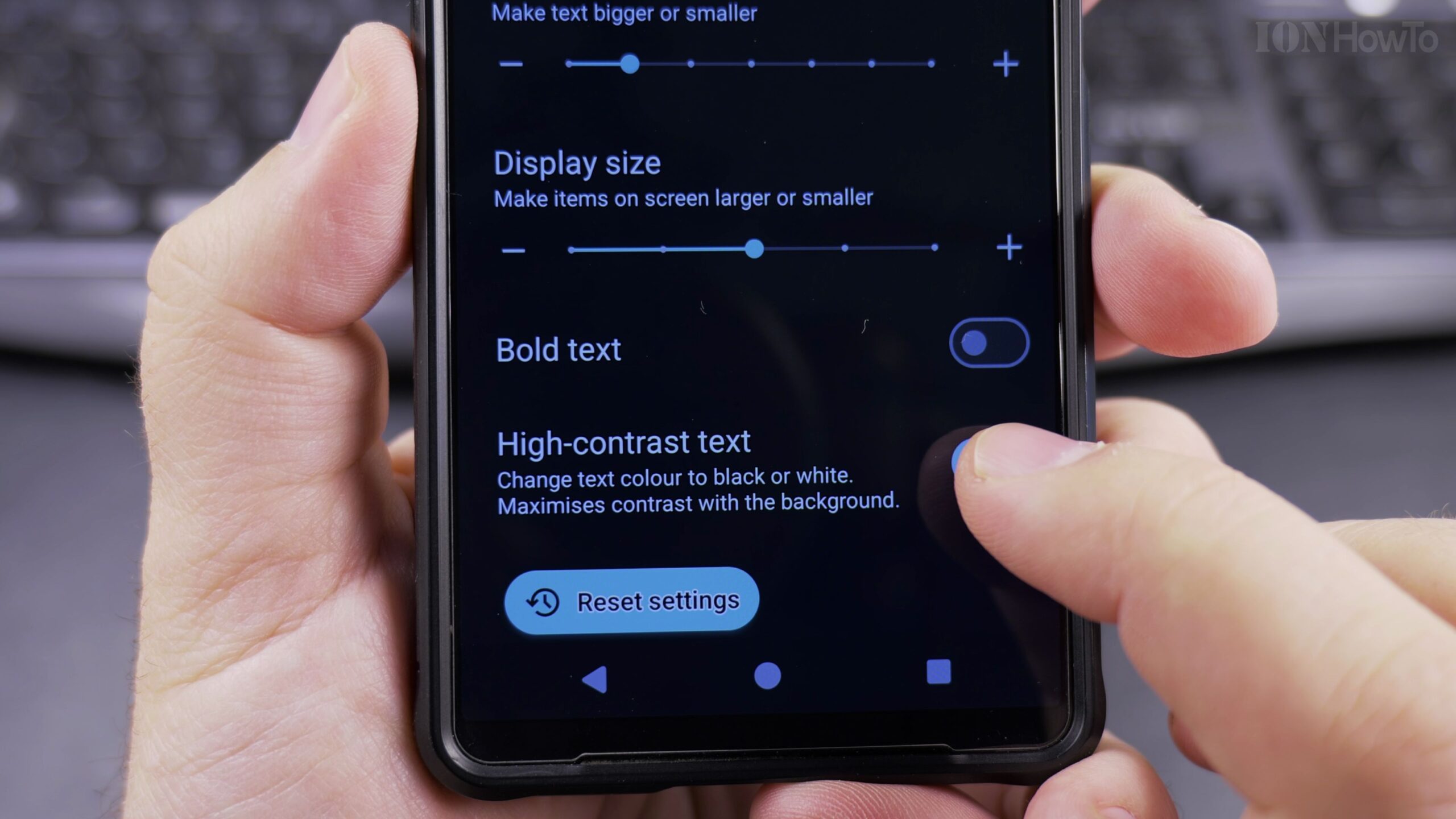
Inside the Display menu, look for the option labeled Display Size and Text. Tap this entry to open the typography and accessibility control panel, where font size sliders and visual enhancement toggles are housed.
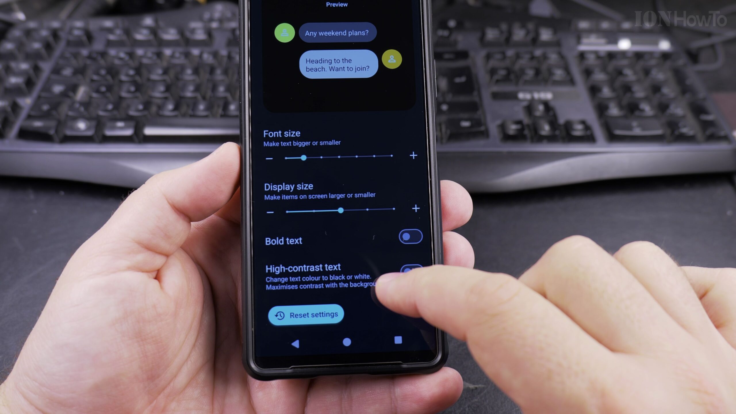
Step 3: Turn On the High Contrast Text Toggle
Scroll down toward the bottom of the Display Size and Text menu. Locate the switch labeled High Contrast Text. By default, this switch is set to the OFF position. Tap the toggle switch to turn it ON. You will immediately notice the labels on your screen snap into sharper focus.
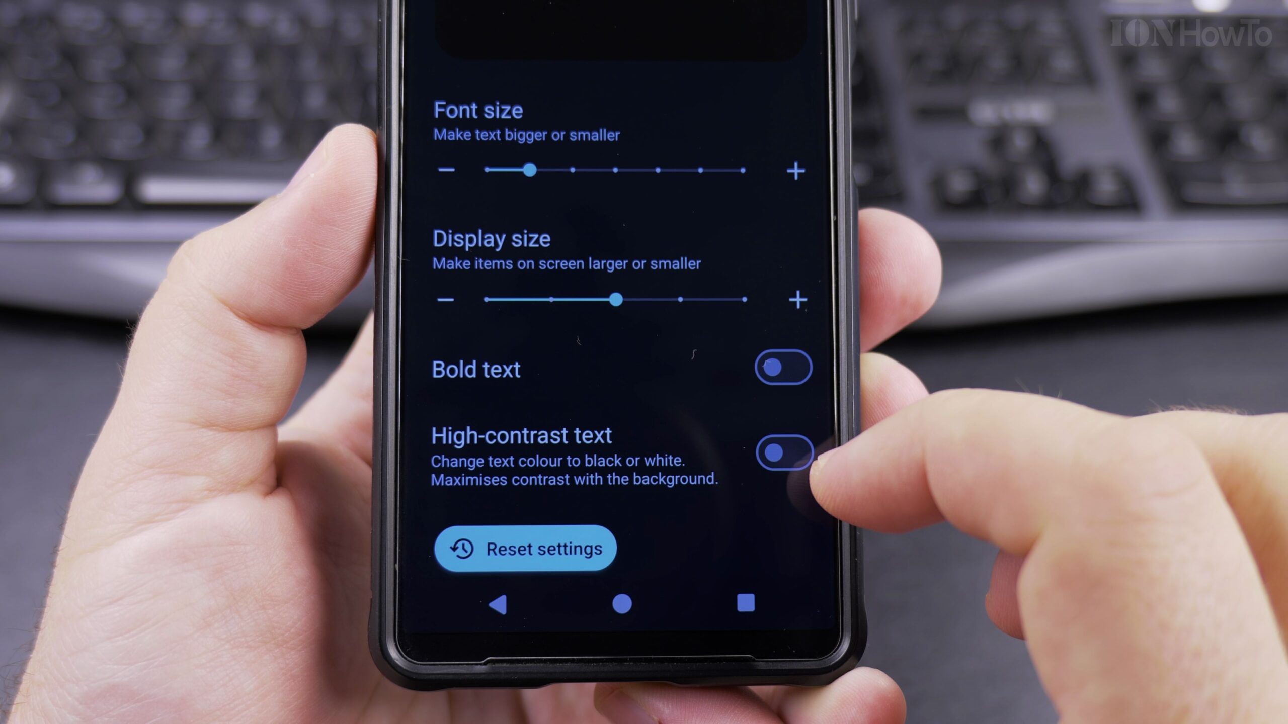
Step 4: Compare Before and After Visibility on Your Home Screen
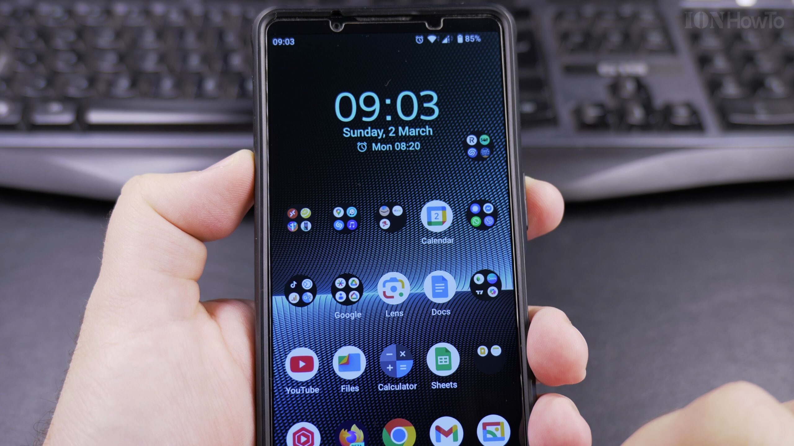
Return to your phone home screen to see the transformation in real time. The digital clock widget, weather numbers, and app label titles now feature clear, defined contrast against your wallpaper. Even over bright or complex backgrounds, each letter remains clearly readable.
Step 5: Inspect Fine Subtext and Notifications
Open your notification drawer or any application with fine subtext. Small timestamps, secondary captions, and system alerts that previously appeared as dim gray now present high-definition edges, making continuous reading effortless and comfortable.
Display Customization Tips and Related Android Tutorials
High contrast text does not consume extra battery power and functions seamlessly alongside Dark Theme and Night Light modes. If you ever decide you prefer softer text, you can turn the feature off at any time by returning to Settings > Display > Display Size and Text and toggling High Contrast Text back off.
To make your Android device even easier to use, read our guide on how to enable the Google Gemini AI assistant on Android, learn how to disable 2G connectivity on Android for stronger security, or explore our full library of Android tips and tricks.
Leave a Reply Cancel reply